Horsehill Vineyards
Proposed Wine Label - Packaging - Team Collaboration

Horsehill Vineyards is Cal Poly Pomona’s vineyard and winery. Every year, they collaborate with the Visual Communication Designers of the Art Department to design a new label for their upcoming vintage. This label was a group effort and designed by Ashley Tossounian, Elizabeth Cabrera, Nancy Govea, Nissa Toriz, and myself.
Client Expectations
A fully designed label that can be marketed to their target audience at the campus Farm Store and restaurants
Celebrate the collaborated effort between students and the winery to create the wine
Emphasize the hand-made quality of the wine
Relate the label back to the college campus

Designer Goals
Experiment with printing and label techniques to result in an eye catching design
Use elements from the campus as design elements to ensure a correlation
Emphasize the award-winning quality of the wine
Add references to the specific three colleges that collaborate with Horsehill Vineyards in the wine’s creation

These initial sketches were the first attempts at addressing these goals. Pomona the goddess references the historical impact of wine in the Pomona area. The other two sketches refer directly to the campus buildings and surround hills.
Research
Wine
The first step as a team was to gain a collective understanding of wine and its relationship back to Pomona, Cal Poly Pomona the college, and Horsehill Vineyards. This research also included a competitive audit to collect data on how wine labels are designed for zinfandel grapes, the primary ingredient for Horsehill Vineyard Wine. This audit also extended into how rosés are designed for.

Printing Techniques
The team also took a trip to Labeltronix, the printing facility that works with Horsehill Vineyards. This exposed the team to the variety of printing techniques ranging from die cuts, double-sided labels, screen printing, foiling, and an emboss. The team was especially inspired by die cuts and the use of a double-sided label.

Rules & Regulations
Research about wine labels was taken upon by the entire studio. The team focused on research towards the laws and regulations from the college and FDA. It was through this research that it was discovered the wine label could not depict students, active drinking, or the school mascot. Nissa Toriz’s research was especially helpful to the entire studio as her work included the exact wording and type that needs to be added on every wine label due to it being an alcoholic beverage.

Design
Typography
The team decided to use a handmade type for this label. This would connotate how the wine is also created by hand picked grapes by the students. It would also add a rustic charm that matches with how Horsehill Vineyards wants to present itself. I designed this type myself and prepared it for digital use.

Illustrations
Through my initial sketches, the team agreed to reference the college campus by its buildings. She carefully illustrated each building on campus that belongs to a college. She also included other iconic buildings and foliage on the campus and foliage.
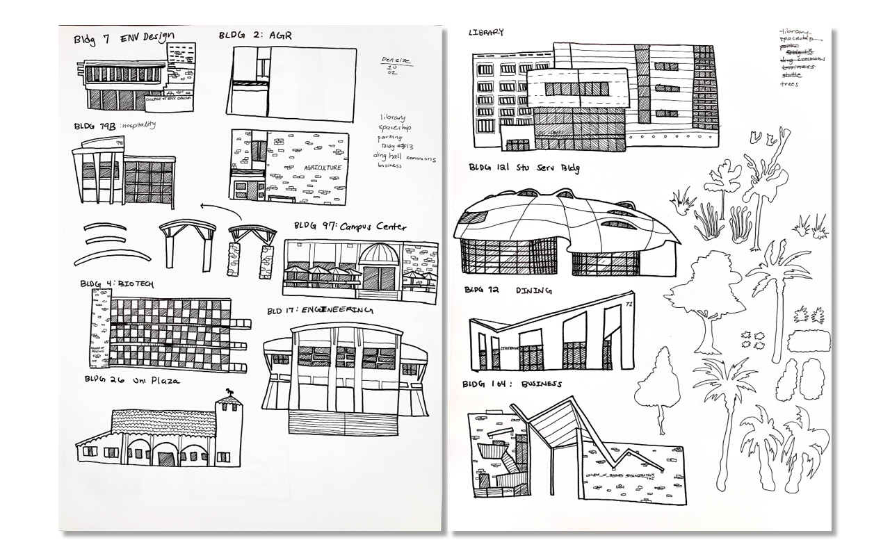
This composition of the illustrated buildings directly references the campus location being on a hill. Yellow distinguishes the three buildings that house the participating colleges. A gold ink or gold foil was pitched by Ashley Tossounian to elevate the appearance of the label and give greater focus to these buildings.

These floral illustrations were created by Elizabeth Cabrera. They became added elements of the label to both describe the flavor of the wine and add a feminine touch to the final label. This femininity was important to help point towards the target audience of rosés as seen by the competitive audit.

Die Cut & Double-Sided Label
The die cut was first pitched by Nancy Govea. The final composition includes a die cut on the center of the label that would become a window through the wine and onto the illustration of the campus. The shapes of this die cut were taken directly from the greenscape on the campus.

Final Composition
The final label combines all the efforts, ideas, and assets of the entire team. It celebrates the hand made production of the wine while incorporating numerous elements relating to the campus. It even distinguishes the participating colleges to honor their contributions.

A full set of packaging and marketing materials was created to pitch this work to the client. This included a wine box, bottle bag, tear sheets, and multiple informative booklets.

Conclusion
This project would not have been possible without an incredible amount of team effort from both the studio and each individual team. Teamwork was the only way every person was able to accrue a mass amount of research and the final results for every label that was presented to the client. Although this label was not chosen to go to print, it was held in high regard by the client for its thorough design inclusions and uniqueness.
