Bleed for Free
Campaign Proposal - Marketing - Screen Printing

“Bleed for Free” is a proposed campaign that centers around gathering, collecting, and informing the public about opportunities to provide feminine hygiene products for those with limited access or resources, such as those in impoverished areas of America or across the seas in developing countries.
Campaign Goals
Gather an audience to view and easily participate in donating feminine hygiene products
Create a lasting image that centers around normalizing the conversation around menstruation
Provide an in-person activity that would encourage participation, engagement, and creation for campaign causes
Designer Goals
Attract attention to campaign through strong and memorable visuals
Create collateral to address the need for tickets, passes, and merchandising
Design a system to engage guests to pursue this event and the educational workshops within it
Design
Due to the limited time this campaign had to run, designing had begun immediately. My main idea surrounded the concept of using period products to design a brand new visual. My sketches show me experimenting with tampons, pads, cups, and period underwear to create shapes, patterns, and illustrations. I had also experimented with different visual metaphors like a caring heart, the beauty of a bouquet, and the heaviness of a cross.

Once moving onto Illustrator to design digitally, I was still experimenting with different compositions with these objects. I had also decided to keep my shapes and lettering bubbly and thick to make the subject matter more friendly in appearance. I had also decided at this stage to primarily work in black and red to draw attention and urgency to the design.

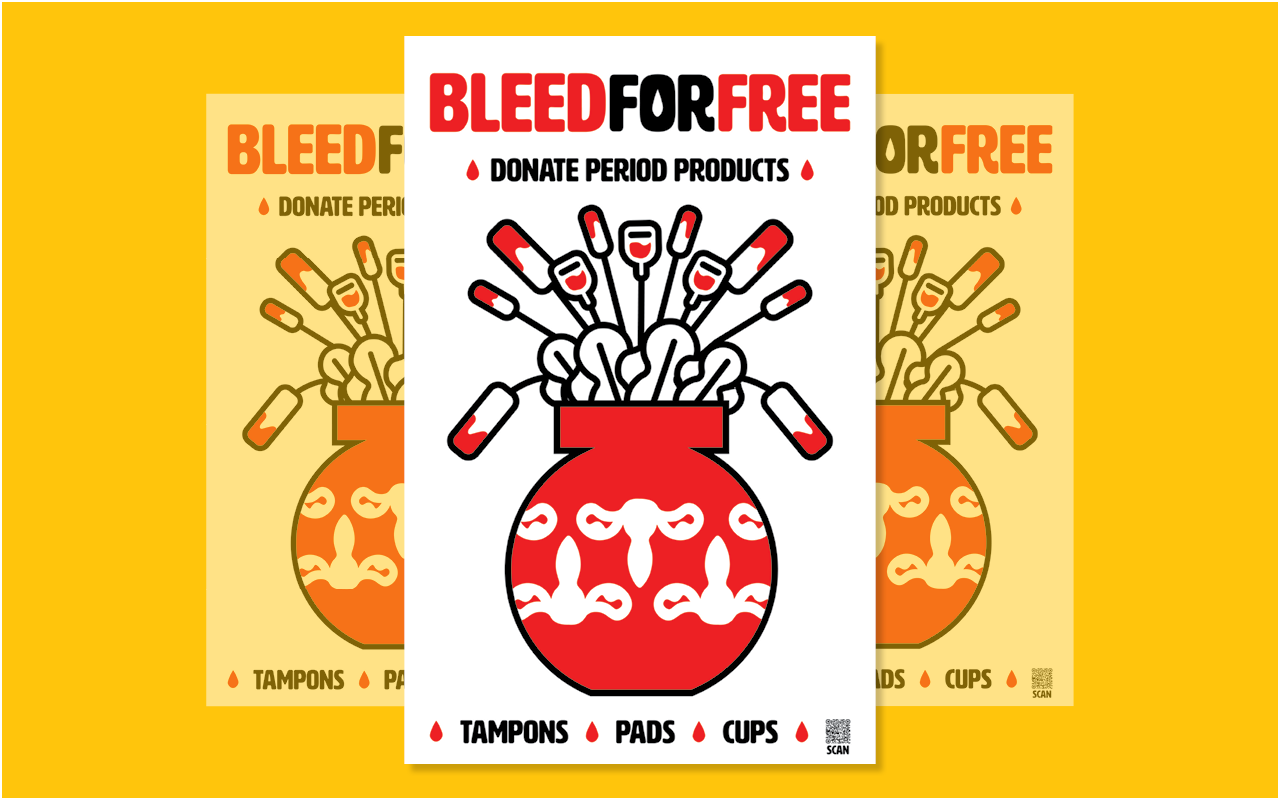
I had finally decided on the concept of using period products and the uterus to create a bouquet. Using a floral theme and metaphor creates an allegory of a well-accepted form of beauty to the public despite dealing with a topic that is infrequently brought up. The term “Bleed for Free” is a play on words of the concept of free bleeding. Although this campaign does not directly advocate for this practice, its relationship to the campaign continues the message of destigmatizing the conversation around periods. I had experimented with different styles of typography and had decided on a bold, simple, friendly typeface for readability and clarity.

Volunteer Workshop
The campaign wanted to bring in volunteers who were interested in this subject matter to gain an experience as they contributed to the cause. A screen printing workshop was held for volunteers to create posters from my design.

These versions of the poster continued a metaphor of how each woman’s experience with a period is different. Some volunteers even made connections to how the paint staining mimicked the literal staining during menstruation.

This experience provided a fun way for volunteers to be engaged with the campaign. Some posters were kept by volunteers due to this being a limited run, but many were then used to spread around the college campus or public spaces to continue to spread the message of Bleed for Free.
Conclusion
This project gave me such a strong sense of how designing could provide multiple different avenues for change. A simple poster and concept design grew into a group of people working together and developing a care for a greater cause.

As a designer, I learned how to work quickly and how to make solid decisions under the pressure of knowing every small thing has an impact from shape language to color choice. This project continues to inspire me to want to work for causes or businesses that support women’s issues. This work shows my strong interest in unique visuals that contain layers of intentional meaning and metaphors.