The Poly Pulse Magazine
Magazine & Layout - Editorial - Hybrid Environment
The Poly Pulse is the school magazine on Cal Poly Pomona that covers the campus’ annual highlights. During this 2025-2026 year, they had decided to streamline their branding and commit to a firm aesthetic inspired by early 2000s teen and editorial magazines. In addition to working on several spreads for this magazine, I had also completed the cover design.
Designer Goals
Adhere and create aesthetic and brand guidelines
Create spreads that are engaging and feature the photography of the article just as much as the typography
Use typographical hierarchy to create a sense of interest and ease of reading
Research
A lot of the research conducted for this magazine involved getting a good understanding of the aesthetics that the Poly Pulse wanted to achieve. In order to do this, the team had created a collaborative Pinterest board to remotely and easily communicate the ideals and visual language the design team should emulate.
These are the main takeaways I took from this visual census: type with large scale differences, negative space as design, limited collar range, cut out photography emulating collage, and the shape of body adjusting with a nearby image.
Design
Spreads & Layouts
This project had begun with doing the layouts for individual stories so each designer could get a good idea on how to work with the new brand guidelines. Below is an example of how the process worked for one such story.

This is how most stories started in the process for me. It began with blocking out how the layout design with the images and later altering how the body fits to best highlight the movement and composition of that image.

Later versions of the same spread would then incorporate elements that would introduce textures, layers, and visual lines to guide the eye to the next page.

This story is a good example of how major changes can happen on a production schedule and how I adjusted my approach for these changes. This sports story had originally been 5 pages and had become 7 pages to meet page requirements from the printer. I had to adjust these two spreads within a much shorter time frame and maintain its quality and visual language just the same despite the time challenge. When looking at the spreads as a whole, a reader would never know that such a time crunch had happened within just one story.

Within the Poly Pulse team, I was gratefully given the honor and award of “Best Spread Design” with the layout design for this horse story. Even if this was the spread that was recognized, I had a fantastic experience and learned a lot from this role. My typographical skills were challenged and my layout skills were refined.

To get a full digital copy of these spreads to preview, they are available for download on the PolyPost website below! I had worked on stories “5 tips for transfers,” “Famous myths and legends at CPP,” “More than a mascot: horse legacy at CPP,” “CPP’s best rivalry by sport,” and “Kill your boredom: Enjoy the decorum.”
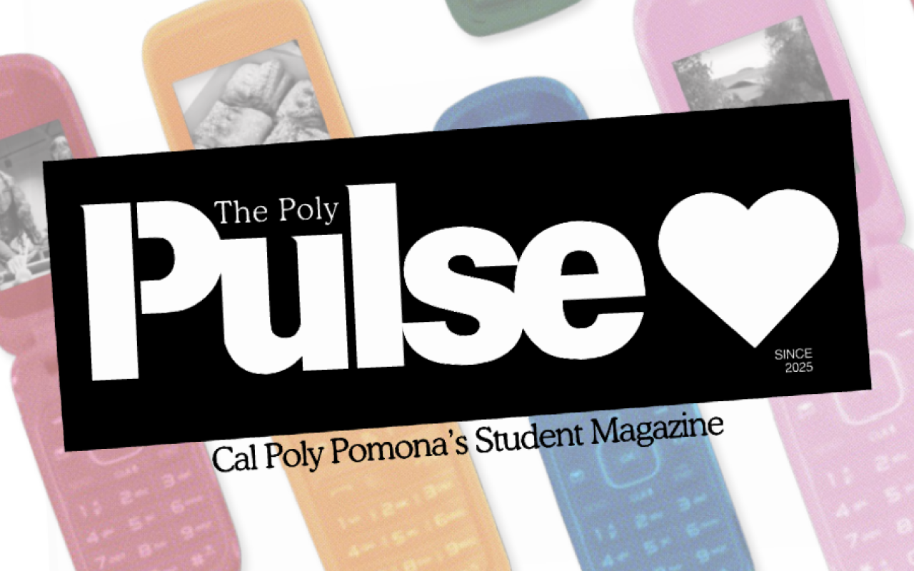
Cover Design
I had multiple proposals for the cover design once it was offered to me. At this point in time, the majority of the layouts and spreads had been completed. My goal was to create a cover that best encompass the multiple qualities that we had shared amongst the spreads.

My ideas involved incorporating the visual elements of collage, color, and type on the cover. I had multiple fun concepts that would allow images from throughout the magazine to be featured on the cover. This would hopefully also encourage readers to read the stories if one of those images was a source of interest for them.

I had multiple proposals for the cover design once it was offered to me. At this point in time, the majority of the layouts and spreads had been completed. My goal was to create a cover that best encompass the multiple qualities that we had shared amongst the spreads.
In addition to the front cover and back cover, I had worked on the spine of the magazine. This was mostly a process that involved collaborating with the printer and their specifications. The size of the magazine had changed from previous years and the file that had circulated from previous had to be updated. I had also been a key consultant and point of communication for clarifying the design intention to the printer in order to get the best results.

Conclusion
Working on this semester-long project was such a huge learning experience. I learned a lot about what it means to work on a team where each member has their various strengths and weaknesses. I also learned a lot about what it meant to communicate with my higher ups about any questions, confusions or challenges I had while working remotely. All in all, I believe this project has made me a better designer for teaching me how to be productive and creative in a remote environment while also learning to communicate through various modes like Zoom, email, text, and call. I also learned a lot about working with such a diverse team with such little contact like the writers, photographers, and editors of the magazine. I hope the work I helped to produce inspires future designers who work on the magazine. I also hope with the new brand guidelines, the work I created helped define a standard of quality for the next team to reference and improve upon.
A reference for this work can be provided upon request.