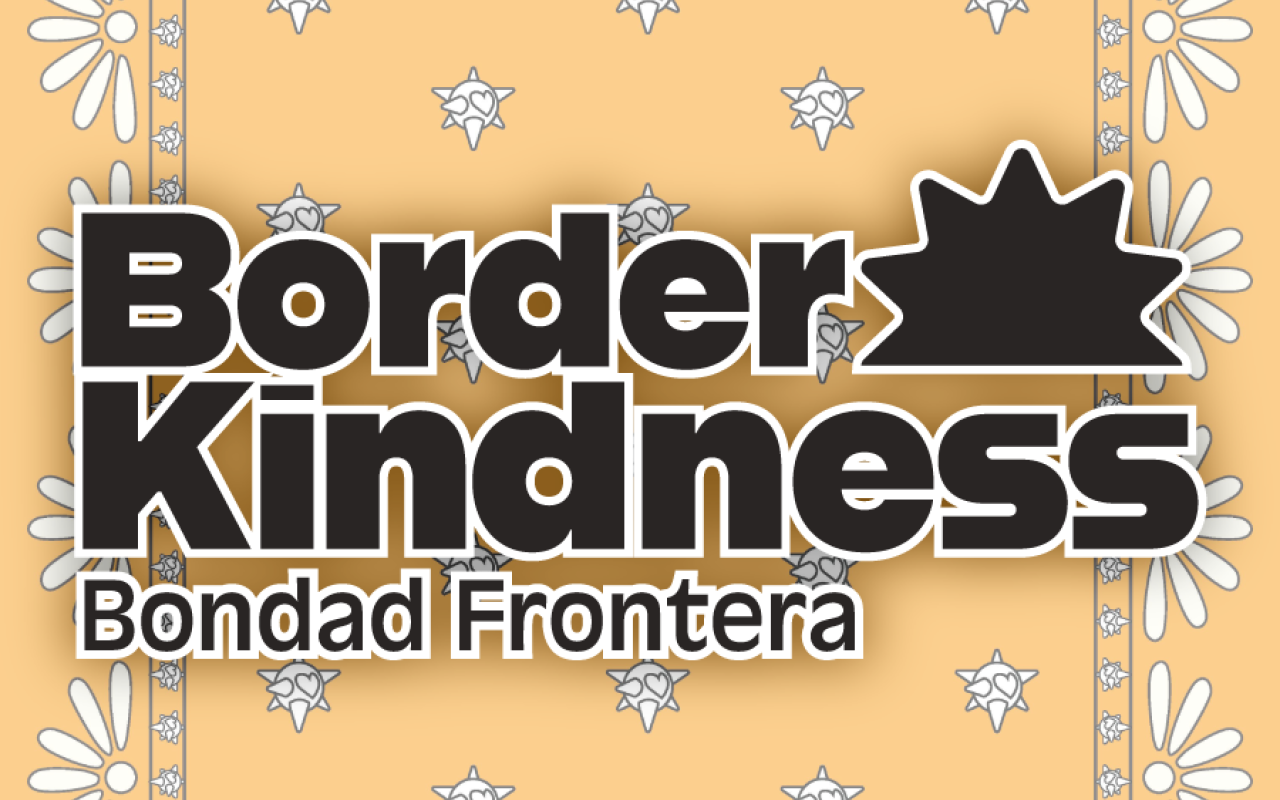
Border Kindness
Organized by AIGA CPP
Branding - Logo Design - Teamwork
The Cal Poly Pomona chapter of AIGA hosts an annual 24-hour design challenge for a nonprofit. This work was produced for Border Kindness. In this time frame, Border Kindness had a variety of needs for the team to address. This included a way to market their upcoming Backpack Drive and a system to communicate their values on their website and social media pages.
I was placed into the branding team. This team focused exclusively on creating logos and a brand identity system for Border Kindness’ subprograms. Design time was limited to a 24-hour window. This included the collaborative research, check-in points, meals, and meetings throughout the design event.
Branding Team’s Goals
Design logos for the subprograms within Border Kindness: Children Empowerment Center and Migrant Moms
Address the bilingual nature nature of the organization
Create a branding guide for this new content
Research
A lot of research was needed to understand the nature of the work that Border Kindness conducted. Individual research from every team was collaboratively collected on Figma. This began the conversation of what aesthetic and design decisions we should be making. Although most of the team decided to do this through mood boards, there was a variety in presentation based on each team’s focus and goals.

A meeting with the client was also conducted through Zoom. We were able to directly ask questions and address concerns we had about our responsibilities. I specifically asked questions about how Border Kindness wants to be understood and what stories they want to tell through their branding. The answers to these questions became extremely useful as we honed in on a color story and imagery that would communicate openness, acceptance, and hope.

Design
Children’s Empowerment Center
A proposed logo was already designed by AIGA CPP board member Elizabeth Cabrera. Using her design as a jumping off point, the branding team began working on the logo for the subprogram called the Children’s Empowerment Center (CEC). Her design gave us a color palette and shape language to continue in our work.

The CEC focuses on providing STEM education and creative opportunities to the youth in immigrated families and communities. This program focuses on providing hope and early fun methods of exposure to what career and life challenges they could face as they are coming of age. With this in mind, I worked on a concept focusing on communicating this youthfulness, hope, and fun. My sketches here show my initial attempts to workout using the 7-pointed star pinata for this logo.

At this point, the entire team does a check-in. This concept was chosen to continue forward with as it was a huge cultural reference and has a historical representation for the same values that the CEC hopes to instill.

In addition to designing out this logo, I created proposed versions that address the multilingual nature of Border Kindness. This idea was approved and below is the resulting work, a set of logos that are in both English and Spanish.

Migrant Moms
Once the CEC logo was at an approved finished state, I moved onto working on a design solution for the Migrant Moms logo. The team collectively agreed to use the imagery of the butterfly. It would communicate the immigration work involved with this program while also being a natural feminine symbol. Here are some sketches of the initial attempts to find a solution.

It became a challenge to find a way to best incorporate images or lettering into the patterning of the wings. After taking a break and sitting back down, I began to try to interpret a pre-existing image on the wings of the butterfly. Through this, I thought of a way to incorporate a fist design into the butterfly wings. A fist was another fitting symbol to represent strength and fortitude amongst Migrant Mothers.

After much feedback from the rest of the branding team and the entire room, this was the final approved logo for Migrant Mothers. Similar to CEC, an English and Spanish iteration was created to accommodate bilingual usages.

Impact on the Team
These logos became featured on other team’s final products. For example, it was edited and used by the social media team to create a highlight section focused on each subprogram on the Border Kindness Instagram.

It also populated parts of the proposed website. Its image and symbolism helped reinforce the explanations provided on their respective pages.

These logos were even adjusted and used in merch proposals. Here is one particular example where one of the logos was used to create a pattern for a handkerchief.

Conclusion
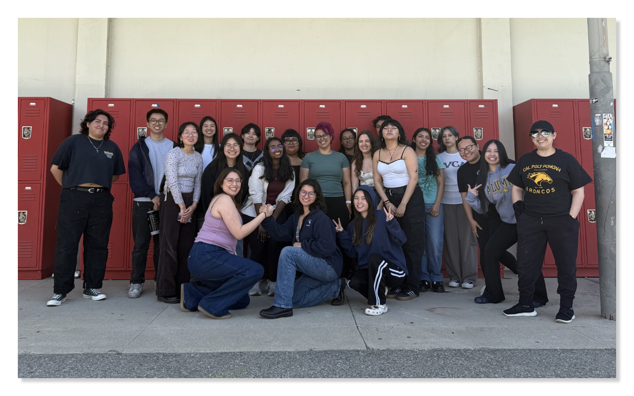
Designathon was a huge challenge due to the time restraint and the nature of the topic at hand. There was a lot of delicate and careful consideration that was made throughout the 24 hour work window. I’m personally very proud of what my team was able to produce and proud of all the participants as a whole for the work that was created with the utmost respect and care. This could not have been made possible without the hard work of the entire time and the AIGA CPP board members Jasmine Guevara, Lisa Romero, Elizabeth Cabrera, Dom Almario, Alessa De Hoyos, and Mia Cherry. Special thanks to the rest of the branding team I worked one-on-one with: Makayla Therien, Yesina Dorado, and Mia Cherry as our team leader.

I learned a lot about myself in how I design and how I work with others under pressure. This experience has since inspired me to look for more nonprofit opportunities. This process has helped me really understand exactly how being a designer can have an impact on the world and people around me.